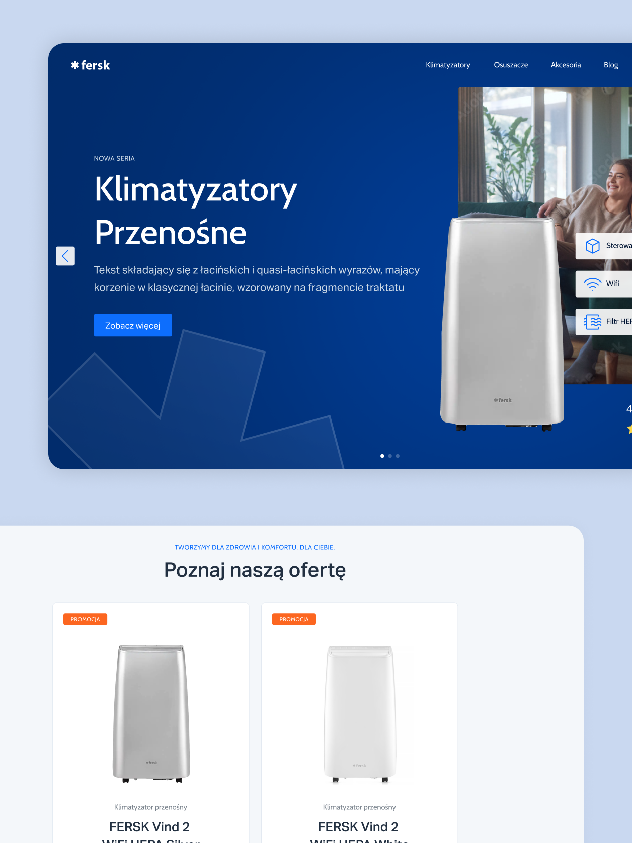
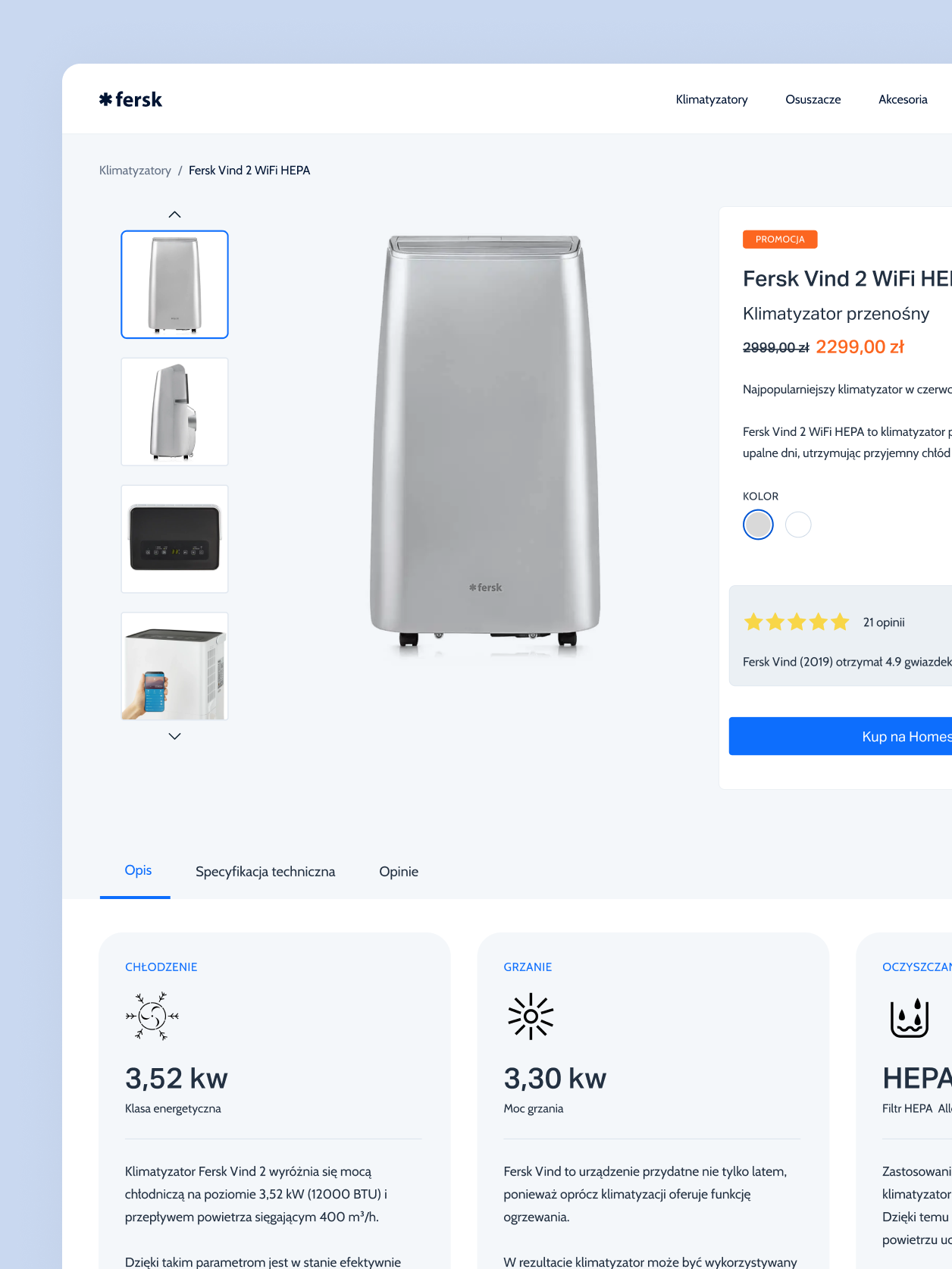
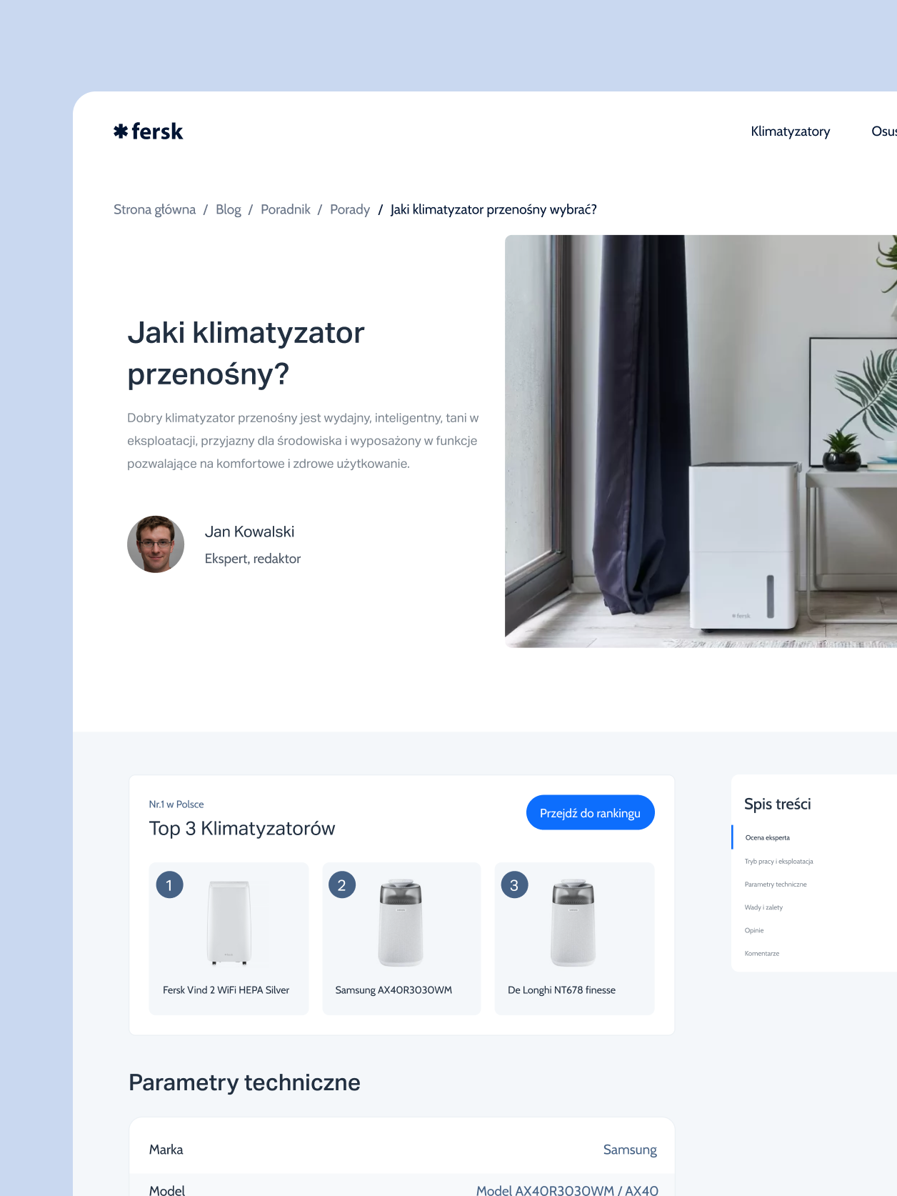
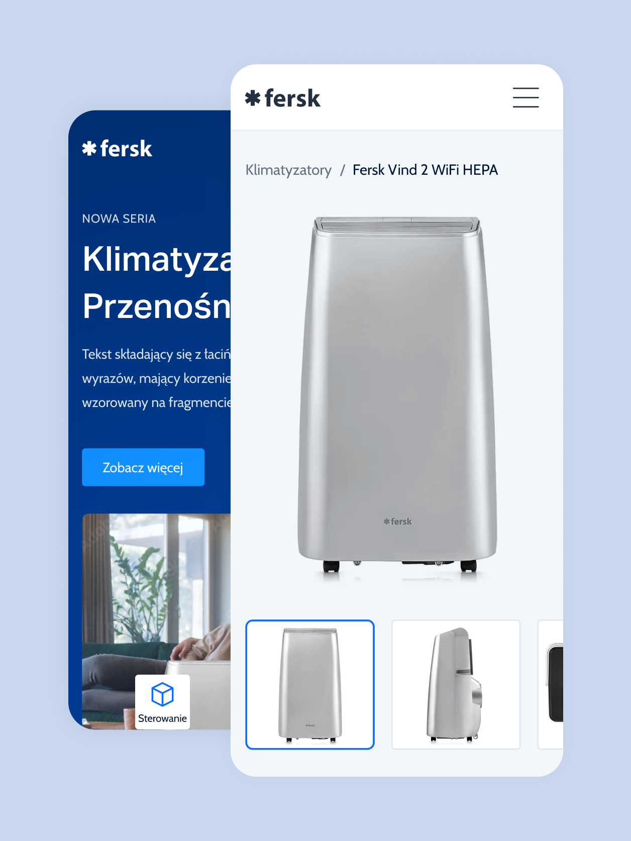
Adopting a Mobile First strategy in the Responsive Web Design (RWD) section was crucial to meet the expectations of users accessing the site via mobile devices. From the very beginning of the design process, the priority was to ensure that the site would look and function excellently on smaller screens, such as smartphones and tablets. We focused on optimizing navigation, loading speed, and the interactivity of elements, so mobile users could seamlessly browse the offerings, read product descriptions, and make purchases.